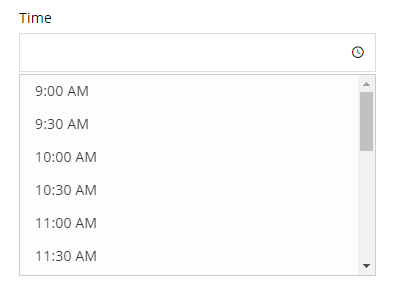
The Time element is a form element that lets the user enter a time.

Settings
Basic
Label
Sets the label of the element.
Description
Sets description text to display below or above the field.
Required
Sets the field to be required, i.e. the user must complete this field.
Styles
Label icon
Choose an icon to display in the label.
Field icons
Choose icons to display on the left or right side of the field.
Field size
Sets the vertical height (using padding) and font size of the field.
Field width
Sets the width of the field, choose one of the preset sizes or choose a custom width.
Field custom width
If Field width is set to Custom enter a custom width using any CSS value.
Custom CSS class
Add a custom CSS class to the field, or multiple classes separated by a space.
CSS styles
Add custom CSS styles to any part of this element by clicking Add a style, choose the selector that the style should apply to and enter the CSS into the box.
Labels
Placeholder
Sets the placeholder text, which is text inside the field that is visible before the user enters a value.
Sub label
Sets a small text label below the field.
Admin label
Sets the admin label which allows you to have different label text for the element when viewing entries and within notification emails than the label text shown in the form.
Tooltip text
Sets the tooltip text which is shown in a small popup when the user interacts with the tooltip trigger.
Tooltip trigger
Choose what the user will be interacting with to show the tooltip, the choices are Field, Icon, or Inherit which will inherit the setting from the parent Group, Page or Form setting.
Tooltip event
Choose the event that will trigger the tooltip to show, the choices are Hover, Click, or Inherit which will inherit the setting from the parent Group, Page or Form setting.
Label position
Choose where to display the label relative to the field, the choices are Above, Left, Inside, or Inherit which will inherit the setting from the parent Group, Page or Form setting.
Label width
If the Label position is set to Left enter a custom label width using any CSS value.
Logic
Enable conditional logic
Enable or disable the conditional logic for this element.
Logic rules
Add a logic rule to this element by clicking Add logic rule, then choose the element, operator and value that will trigger the rule.
Data
Default value
Sets the default value of the element, which is the value that the field has when the form is first displayed. The time should be entered in the format HH:MM, for example 16:30. The variable {now} can be used to use the current time (according to the configured WordPress timezone), this variable also supports modifiers such as {now|+2 hours}.
Dynamic default value
Enable or disable the dynamic default value for this element. This option allows the field value to be set from a URL parameter, block value, shortcode attribute or filter hook. See the Dynamic default value guide for more information.
Parameter name
Sets the name of the parameter to use as the source of the dynamic default value.
Time range
Sets the minimum and maximum times that can be selected. The variable {now} can be used to use the current time (according to the configured WordPress timezone), this variable also supports modifiers such as {now|+2 hours}.
Minute interval
Enter the minute interval between each time in the list.
Locale
Sets the locale of the timepicker, which will translate the timepicker and set the time format according to regional standards. If set to Default it will use the Locale from Edit Form → Settings → Language.
Time format (JS)
The format of the time when displayed in the form. If empty, the global setting will be used or the Locale will determine the time format according to regional standards. See this page for how to set a custom time format.
Time format (PHP)
The format of the time when displayed in notifications and when viewing entries. If empty, the global setting will be used or the Locale will determine the time format according to regional standards. See this page for how to set a custom time format.
Auto open timepicker
If enabled, the timepicker will be opened automatically when the user interacts with the field.
Read only
If enabled, the user will be unable to type in the field but will still be able to choose a time using the timepicker.
Show in email
If enabled, the submitted element data will be shown in the default notification email.
Save to database
If enabled, the submitted element data will be saved to the database and shown when viewing an entry.
Advanced
Unique ID
The unique element identifier is displayed here, you may need this for advanced usage.
Visibility
Sets the element to only be visible when viewing/editing entries (Admin only), or only visible to logged in or logged out users.
Validators
Add validators to the element which checks whether the data entered by the user is valid and displays an error message if it’s not valid. Available validators for this element are listed below.
- In Array – checks that the value is in a list of allowed values (can be inverted)
- Prevent Duplicates – checks that the same value has not already been submitted
Translations
You can translate the text of any relevant settings here.
