
The CAPTCHA element displays an image containing characters that the user must enter before submitting the form. This helps prevent automated spam submissions.
The image is generated by Quform on your server, so no external account or API keys are needed.
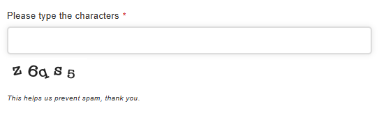
Adding a CAPTCHA
Add a CAPTCHA element to the form. Its default settings are ready to use.
Save the form, then submit a test entry from the page containing it. The entered characters must match the image, although uppercase and lowercase letters are treated as equivalent.
Settings
Basic
Label
Sets the label of the element.
Description
Sets description text to display below or above the field.
Styles
Label icon
Choose an icon to display in the label.
Field icons
Choose icons to display on the left or right side of the input field.
Field size
Sets the padding and font size of the input field. Choose Inherit to use the setting from the parent group, page, or form.
Field width
Sets the width of the input field. Choose a preset size, Custom, or Inherit to use the setting from the parent group, page, or form.
Field custom width
If Field width is set to Custom, enter a custom width using any valid CSS width.
Number of characters
Sets the number of characters displayed in the CAPTCHA image. The default is 5.
Image width
Sets the width of the CAPTCHA image in pixels.
Image height
Sets the height of the CAPTCHA image in pixels.
Background color
Sets the background color of the CAPTCHA image.
Text color
Sets the color of the characters in the CAPTCHA image.
Font
Choose the font used for the characters in the CAPTCHA image.
Minimum font size
Sets the minimum character font size in points.
Maximum font size
Sets the maximum character font size in points.
Minimum letter rotation (degrees)
Sets the minimum rotation angle for the characters.
Maximum letter rotation (degrees)
Sets the maximum rotation angle for the characters. Each character’s angle is randomly chosen between the minimum and maximum.
Retina image
Generates the image at twice its displayed dimensions for sharper rendering on high-resolution screens.
Custom CSS class
Add custom CSS classes to the input field or its element wrapper using the Field and Element tabs. Separate multiple classes with a space.
CSS styles
Add custom CSS styles to parts of the element by clicking Add a style, choosing the selector, and entering the CSS into the box.
Labels
Placeholder
Sets text displayed inside the input field before the user enters a value.
Sub label
Sets a small label below or above the field.
Tooltip text
Sets the text displayed in a small popup when the user interacts with the tooltip trigger.
Tooltip trigger
Choose Field, Icon, or Inherit to use the setting from the parent group, page, or form.
Tooltip event
Choose Hover, Click, or Inherit to use the setting from the parent group, page, or form.
Label position
Choose Above, Left, Inside, or Inherit to use the setting from the parent group, page, or form.
Label width
If Label position is set to Left, enter a custom label width using any valid CSS width.
Logic
Enable conditional logic
Enable or disable conditional logic for the element.
Logic rules
Choose whether to show or hide the element when all or any of the rules match. Click Add logic rule, then choose the element, operator, and value for each rule.
Advanced
Unique ID
The unique element identifier is displayed here. You may need this for advanced usage.
Visibility
Choose Everyone to display the CAPTCHA to all users, or Logged out users only to omit it for logged-in users.
Translations
Customize the validation messages displayed when the field is empty or the entered characters do not match the image.