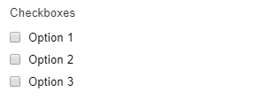
The Checkboxes element is a form element that lets the user choose multiple options from a list.

Settings
Basic
Label
Sets the label of the element.
Options
Sets the options that the user can choose form. The submitted value can be different from the option text by enabling the Customize values option and changing the value of each option. Set the default selected options by clicking the check (tick) icon for the option. You can add a background image or icon to the options by clicking the settings (cog icon) for the option.
Description
Sets description text to display below or above the field.
Required
Sets the field to be required, i.e. the user must complete this field.
Styles
Label icon
Choose an icon to display in the label.
Options layout
Sets layout of the options, the choices are One option per line, Inline, or a column layout from 1 to 20 columns.
Responsive columns
If Options layout is set to a column layout, select a screen width to stack the columns.
Responsive columns custom
If Responsive columns is set to Custom…, enter a custom width at which to stack the columns using any CSS value.
Options style
Set the style of the options, the choices are:
- Default – use the browser default style
- Hide input – hide the checkbox input
- Button – style the options as buttons
You can set a background image or icon by editing the settings for each individual option.
Options button style
If Options style is set to Button, choose the style of the button.
Options button size
If Options style is set to Button, choose the size of the button.
Options button width
If Options style is set to Button, choose the width of the button.
Options button custom width
If Options button width is set to Custom…, enter a custom button width using any CSS value.
Options button icon position
If Options style is set to Button, choose the the icon position. Icons can be set on each option individually in the option settings.
Custom CSS class
Add a custom CSS class to the field, or multiple classes separated by a space.
CSS styles
Add custom CSS styles to any part of this element by clicking Add a style, choose the selector that the style should apply to and enter the CSS into the box.
Labels
Sub label
Sets a small text label below the field.
Admin label
Sets the admin label which allows you to have different label text for the element when viewing entries and within notification emails than the label text shown in the form.
Tooltip text
Sets the tooltip text which is shown in a small popup when the user interacts with the tooltip trigger.
Tooltip trigger
Choose what the user will be interacting with to show the tooltip, currently the only choice for this element is Icon.
Tooltip event
Choose the event that will trigger the tooltip to show, the choices are Hover, Click, or Inherit which will inherit the setting from the parent Group, Page or Form setting.
Label position
Choose where to display the label relative to the field, the choices are Above, Left or Inherit which will inherit the setting from the parent Group, Page or Form setting.
Label width
If the Label position is set to Left enter a custom label width using any CSS value.
Logic
Enable conditional logic
Enable or disable the conditional logic for this element.
Logic rules
Add a logic rule to this element by clicking Add logic rule, then choose the element, operator and value that will trigger the rule.
Data
Validate submitted value
Checks that the submitted value is actually one of the configured options. Disable this if the options are set dynamically.
Dynamic default value
Enable or disable the dynamic default value for this element. This option allows the field value to be set from a URL parameter, block value, shortcode attribute or filter hook. See the Dynamic default value guide for more information.
Parameter name
Sets the name of the parameter to use as the source of the dynamic default value.
Show in email
If enabled, the submitted element data will be shown in the default notification email.
Save to database
If enabled, the submitted element data will be saved to the database and shown when viewing an entry.
Advanced
Unique ID
The unique element identifier is displayed here, you may need this for advanced usage.
Visibility
Sets the element to only be visible when viewing/editing entries (Admin only), or only visible to logged in or logged out users.
Validators
Add validators to the element which checks whether the data entered by the user is valid and displays an error message if it’s not valid. Available validators for this element are listed below.
- Prevent Duplicates – checks that the same value has not already been submitted
Translations
Depending on the current settings this tab may or may not be visible, you can translate the text of any relevant settings here.
