
The Page element lets you split a form into multiple steps. Users move between pages using the Next and Back buttons, then submit the form on the final page.
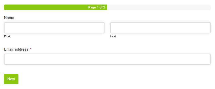
Adding a page
While editing the form, click the + icon beside the page tabs at the top of the form builder.
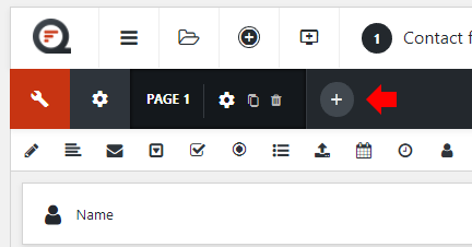
This creates a new page tab. Click the tabs to switch between pages, then add elements to each page.
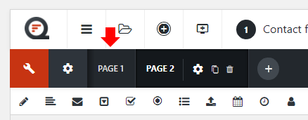
To open a page’s settings, click the settings icon for that page in the page tabs.
Settings
Basic
Label
Sets the label used to identify the page in the form builder. It is also used in the page progress indicator when the indicator displays page labels.
Title
Sets the title displayed at the top of the page. Choose the HTML heading tag using the selector beside the title.
Description
Sets description text displayed below the title at the top of the page.
Styles
Field size
Sets the padding and font size of fields within the page. Choose Inherit to use the form setting. Individual fields or groups can override this setting.
Field width
Sets the width of fields within the page. Choose a preset size, Custom, or Inherit to use the form setting. Individual fields or groups can override this setting.
Field custom width
If Field width is set to Custom, enter a custom width using any valid CSS width.
Group style
Choose Plain for no additional styling, or Bordered to add a border and padding around the page content.
Border color
If Group style is set to Bordered, choose the border color.
Background color
If Group style is set to Bordered, choose the background color.
CSS styles
Add custom CSS styles to parts of the page by clicking Add a style, choosing the selector, and entering the CSS into the box.
Labels
Tooltip trigger
Sets the default tooltip trigger for fields within the page. Choose Field, Icon, or Inherit to use the form setting. Individual fields or groups can override this setting.
Tooltip event
Sets the default event that displays tooltips within the page. Choose Hover, Click, or Inherit to use the form setting. Individual fields or groups can override this setting.
Label position
Sets the default label position for fields within the page. Choose Above, Left, Inside, or Inherit to use the form setting. Individual fields or groups can override this setting.
Label width
If Label position is set to Left, enter a custom label width using any valid CSS width.
Show label in email
If enabled, the page’s Label is displayed as a heading in the default notification email.
Show label in entry
If enabled, the page’s Label is displayed as a heading when viewing an entry.
Logic
Enable conditional logic
Enable or disable conditional logic for the page. This allows the page to be shown or skipped based on values entered elsewhere in the form.
Logic rules
Choose whether to show or hide the page when all or any of the rules match. Click Add logic rule, then choose the element, operator, and value for each rule.
Advanced
Unique ID
The unique page identifier is displayed here. You may need this for advanced usage.
Page navigation
Configure the page progress indicator at Edit Form → Settings → Pages.
Configure the Next and Back buttons at Edit Form → Settings → Style → Buttons.