Info Menu
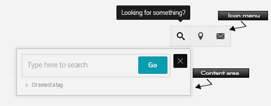
Theme Options → Components → InfoMenuThis is an icon-based clickable menu where you can build in various dynamic content via shortcodes and widgets or via our preset options, such as: forms, search bar, location map, video and more. The content section can be displayed in two ways, “Pop Out” or “Slide Out”, giving it various content usage depending on the function you choose.
Color palettes can be applied to the content area of the Info Menu in Theme Options → Colors → Info Menu → Select a Palette for this area.
Image: the example shown in the image is the Search field option used in a “Pop Out” content area style.
Pop Out width
In InfoMenu → Pop out width , you can choose a width for the Info Menu content area when used in Pop Out mode. If you click the Larger Screens tab, you can set a new (larger) width for larger screens.
Buttons Style
In InfoMenu → Buttons Style , you can choose from 3 button styles for the menu icons to be displayed.