This is a summary of React’s layout structure – The backbone for your site.
React has been built with function and versatility in mind, starting with the layout structure. Here you will learn about the different sections and the terminology used within the theme.
Main sections
The structure has 4 main blocks with subsections, some of which can be switched on or off completely, or for only the devices of your choice. Items with an asterisk (*) in the list below can be switched on or off:
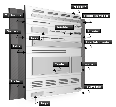
- Pop Down *
- Pop Down widget area
- Pop Down trigger
- Header
- Top Header *
- Main header
- Solo Navigation *
- Content
- Intro *
- Content area
- Footer
- Main footer widget area *
- Subfooter *
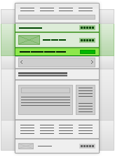
Pop Down
Widget area / Component
A dynamic component that can be toggled from hidden to visible, or visible to hidden, via a trigger message at the very top of the page. The Pop Down uses cookies so the user only needs to see this message once. There is also an option for the user to dismiss the trigger message. The Pop Down space is a widget area so you can build in various content via shortcodes and widgets.
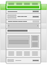
Top Head
Section / Navigation area
The first of the header sections. It can be utilized for various functions, like contact details (with form popups), social links, a navigation menu and more. It can also be set to 3 sizes depending on its usage.
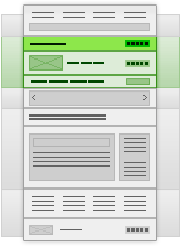
Main Header
Section / Pimary navigation
The second header section is comprised of your logo (which can be set to left or right) and a main navigation area with a home icon. It also holds the Info Menu (more info below).
Info Menu
This is an icon based clickable menu where you can build in various dynamic content via shortcodes and widgets or via our preset options, such as forms, search bar, location map, video and more. The content section can be displayed in two ways: “Pop Out” or “Slide Out”. This gives it various content usage depending on the function you choose.
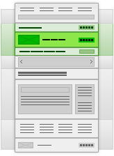
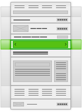
Solo Navigation
Section / Primary navigation
This is the last header section. It can be used only for site navigation purposes, hence its name. It can hold a primary or secondary navigation area and a search bar.
Content
The main content area for the theme:
Intro
The first of the content area sections, the Intro starts the page with a heading and subheading. You may be familiar with this section if you have used WordPress before.
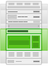
Page content
This is where the WordPress page / post content goes. You can add the sidebar widget area to the left or right and vary its width to suit your site.
Breadcrumbs
Allow the user to back track their steps by using the breadcrumbs plugin. It’s at the top of the page content but can also be used as a widget.
Sidebar widget area
WordPress default widget area, which is to the side of the page content area. It can be switched on or off and placed left or right using the per page (metabox) options.
After content widget area
A handy widget area after the page content.
Slider area
Revolution Slider
If in use, it can hold a Revolution slider of your choice.
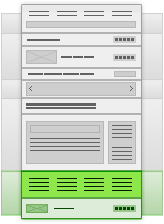
Main Footer
Widget area
The larger of the two footer areas, this is a widget area allowing you to build in various content via shortcodes and widgets.
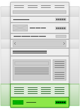
Sub Footer
Section
The last area in the footer section and the last of the page too. It has many uses and variations in function. It can hold a logo, with a pop out when user reaches the end of the page, social icons, background video / audio / image controls and more.