Using Theme Layouts – Video
Create global site layouts
1: Choose which of the theme sections to show
First you should select all the theme areas you will use for your theme. You can turn most areas on or off via Theme Options → Design → On / Off.
2: Choose a base layout
In Theme Options → Design → Layout → Layout Options → Page layout type, you can select from one of the following types:
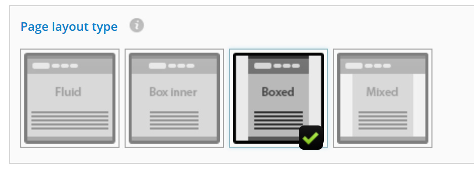
- Fluid: The fluid mode will set all content to the full screen width. No matter the size of the screen, the content will always be 100%. The site background will therefore not be visible unless you use Margins and Section space.
- Boxed inner: Like in Fluid mode, the page areas will be set to 100% of the screen size, however, this time the inner part of those areas will be set to the Box Width (a fixed width). As a result, the background will not be visible unless you use Margins and Section space.
- Boxed: The Boxed mode sets all of the page areas to the Box width (a fixed width). You can align this box to the left or right using Margins, it is centered by default.
- Mixed: This mode is a blend of the Boxed, Boxed inner and Fluid modes, allowing you to choose if you want to “stretch” (make full width) some areas of the page, while keeping the others in Boxed mode.
3: Further layout options
Box width
If you are using Mixed, Boxed or Boxed inner layout modes you will need to determined a fixed width. This will be the maximum width of the content – if the screen is smaller it will automatically fit.
You can set the default boxed width and a larger boxed width for larger screens in: Theme Options → Design → Layout → Layout Options → Maximum page width.
Mixed mode options
When Mixed mode is selected, you will see some new options applicable to this mode. Here you can choose to Stretch an area which will make it 100% of the page. By using the Make fluid option, you can choose to keep the inner area as a fixed box width or instead make it full width (fluid).
4: Margins / area space
Theme Options → Design → Layout → Page margins / Vertical margins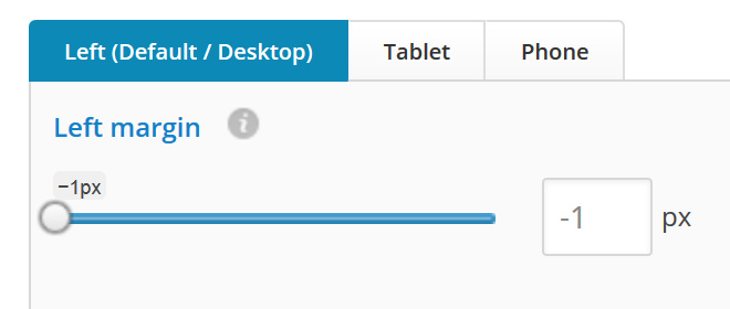
React allows you to adapt your layout even further by adding a dividing margin or “space” to different sections of the theme.
To achieve optimum design on all devices, you can set a different margin / space for each device screen size.
Note: If the margin for a device is set to -1 the default value will be used.
Examples
How to make my site be on the left of the screen?
Set the Left margin to 0 if you want it on the left end of the screen. A larger value will move it from the screen edge for the value you set.
How to make my site be on the right of the screen?
Set the Right margin to 0 if you want it on the right end of the screen. A larger value will move it from the screen edge for the value you set. You can not align the page right if the Left margin value is not set to -1.
Go down link
Switch On the Go down arrow if you are starting your main content or header much further down the page using margins. Using this button will let users know there is more content on the page and to bring them to it when the button is clicked.
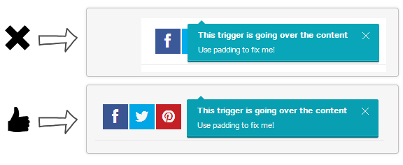
5: Padding fixes
Theme Options → Design → Layout → Padding fixesIf absolutely positioned elements on the site overlap some of the page content, you can add the required padding value to move the two elements apart.