Mobile friendly – Device Menu
The Device Menu is an optional menu that is designed to suit smaller screens. This menu is triggered by an icon and will slide out from the side of the screen. You may recognize this style of menu from popular smart phone apps, like Facebook. There are two possible Device Menus you can enable on the theme (see below).
Left Device Menu
The left Device Menu is made up from the Primary and Secondary Menus. If there is a search bar used in the Solo nav it will be shown in here too.
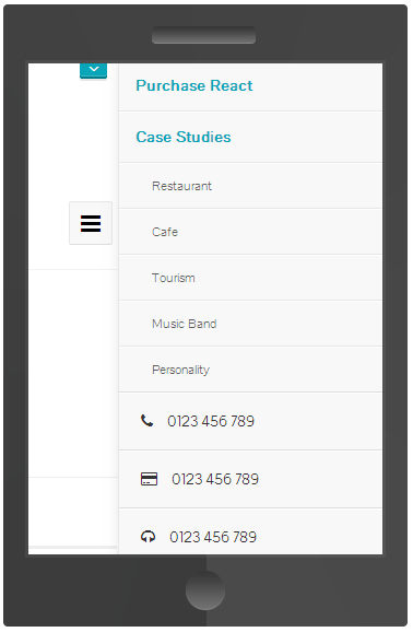
Right Device Menu
The right Device Menu is made up from all the content inside the Top Header, including the Top Header menu, contact details menu and social icon links.
Activate Device Menu
Go to: Theme Options → Global → Navigation → Navigation convert points. Here you can select the most optimum screen size to swap the menus to the Device Menu.
Styling
Add Color
Go to: Theme Options → Design → Color → Device Menu. More Info.