Solo Navigation
To activate
Go to: Theme Options → Design → On / Off → Solo Nav. Switch it on for the devices of your choice.
Note: The Solo Navigation area can also be switched into the Device Menu for smaller devices. See Responsive Options below.
Choose a WP Menu
In Theme Options → Global → Navigation → Navigation options → Location of Primary nav, you can choose which of the two main Navigation areas (Solo nav or main header) of React you want to use for the Primary Menu. The other area will automatically become the Secondary menu.
Note: You will need to create the Primary (and Secondary) WP Menus in Appearance → Menus → Create a new menu. Remember to assign the new Menu to one of the React theme locations (in this case Primary or Secondary). Appearance → Menus → Menu Settings → Theme locations → Primary Menu / Secondary Menu. More info here.
Add a Menu description
First you need to add the text for the description. Go to: Appearance → Menus → Menu Structure → (toggle open menu item) → Description*. Add the description text in the field provided.
* If Description field is not visible, you can switch it on in Appearance → Menus → Screen Options (Top right of page) → Description. Tick the box to show the Description field.
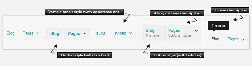
How to display the Description
In Theme Options → Global → Navigation → Navigation styles → Navigation style → Description type, you can choose from either a hover description or a line of text under the menu link.
Home button icon link
To activate the Home button go to: Theme Options → Global → Navigation → Navigation options → Show home icon?. Switch it on.
Once the Home button has been switched on you can choose a style for it from the dropdown list.
Note: The home Button will always show next to the Primary Menu.
Solo nav search field
Go to: Theme Options → Global → Navigation → Navigation options → Solo nav search field. Switch on to activate the global search bar.
Styling
Menu styles
Go to: Theme Options → Global → Navigation → Navigation styles → Navigation style → Solo Nav. Here you can choose from a variety of styling options for the Menu.
Add Color
Go to: Theme Options → Design → Color → Solo Nav. More Info.
Add Texture or Background image
Go to: Theme Options → Design → Style → Solo Nav. More Info.
Responsive options
Switch area on or off for devices
Theme Options → Design → On / Off → Solo NavSwitch to Device menu
Choose when to switch Solo Nav and Main Nav to the Device Menu.
Theme Options → Global → Navigation → Navigation convert points → When to swap Main Header and Solo Nav to the Device Menu