
Step 1
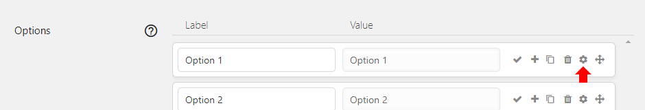
Add a Radio Buttons or Checkboxes element to the form. Go to the Settings for it and on the Basic tab at the Options go into the Settings (cog icon) for the first option.
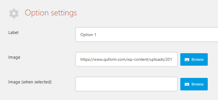
At the Image setting either enter a URL for an image or click Browse and choose an image from the media library.
If you want a different image to be displayed when the option is selected, choose a different image at the Image (when selected) setting.
You’ll end up with the settings below.
Click Save (the green tick) to save the option settings. Now duplicate this option for all of the choices you want in this field.
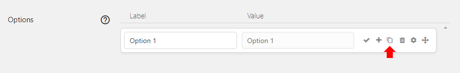
Change the Label of each of the duplicate options to suit, then go into the Settings (cog icon) for each duplicated option and choose a different image.
Step 2
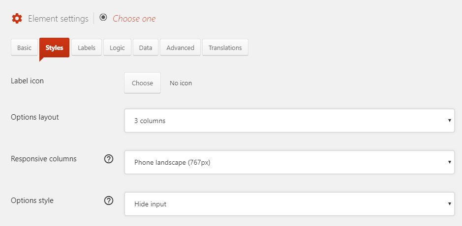
Now go to the Styles tab of the element settings, at Options layout choose 3 columns (or whatever suits) and at Options style choose Hide input.
At the bottom of the Styles tab click Add a style and choose the selector Option label then enter this CSS code into the field:
1 2 3 4 5 | width: 100%; height: 250px; border: 2px solid #fff; background-position: center center; background-repeat: no-repeat; |
width: 100%;
height: 250px;
border: 2px solid #fff;
background-position: center center;
background-repeat: no-repeat;
Click Add a style again and choose the selector Option label (when selected) then enter this CSS code into the field:
1 | border: 2px solid #81bf0b; |
border: 2px solid #81bf0b;
Click Add a style again and choose the selector Option text then enter this CSS code into the field:
1 | display: none; |
display: none;
You can adjust these styles to suit, that’s it!